Bland Cars

Automobile styling fashion swings to and fro across several dimensions.  One such dimension is simplicity versus complexity.  I sometimes refer to the complex extreme of styling as "Baroque," a condition that seems to be prevailing at present.  The other end of that continuum might be called blandness, if one is feeling prejudicial.

Modernist ideology in the fields of architecture and design has contended that simplicity is better than complexity.  Form should follow function and ornamentation is to be avoided.  This "purist" point of view was held by industrial designers in the 1930s and seems to have infected some (but not all) American automobile stylists in the late 1940s and again around the year 2000.  A variation on this was the notion that the shape of a car should be its most interesting visual feature, so ornamentation is best minimized, if not eliminated.  My impression is that some General Motors stylists of the 1990s held that sculpturing sans-ornamentation was the way to go.

Today's post presents some examples of cars with simple body shapes and not much ornamentation.  This is not to say that such an approach to styling is bad; my point is that it is not necessarily a means to aesthetic success.

Gallery

An example of General Motors' styling policy of promoting sculpting and minimizing ornamentation is the third-series Chevrolet Cavalier introduced for the 1995 model year.  The publicity photos shown above used dark-colored cars and lighting to emphasize the body sculpting.  But light colors and scattered lighting tended to make the cars look bland and anonymous.  Nothing really wrong with the styling, but nothing to grab and hold one's attention either

Shown here is the 2001 Cadillac DeVille DTS sedan, another example of GM's thinking in those days.  Here sculpting is minimized along with ornamentation to yield a "pure," but truly bland design.

The 1948 Kaiser design is a prime example of late-1940s simplicity.  Ornamentation was so minimal that Kaisers and sister-brand Frazers even lacked hood ornaments, an item potential buyers expected because all other new American cars had them.  Kaiser later had to add a bolder, chrome-laden grille and a hood ornament in an effort to stay competitive, but the basic design was awkward and sales began to dwindle.

The 1949 Ford was a styling success.  It was better proportioned and shaped than the Kaiser, though simple as well.  Another Ford advantage was that ornamentation was not minimized.  For instance, the chromed strip along the sides helped to break up a form that was otherwise featureless aside from strakes related to the tail lights.  The key feature was the bold, chrome-plated grille with the distinctive round "spinner" and the echoing cut-out on the face of the hood.  Plus, there was a hood ornament.  If the Ford lacked the ornament, strake, side strip and spinner (imagine the grille having only the horizontal grille bar continuing uninterrupted by the spinner), the car would seem pretty bland.

Opel Kapitän's Curious Almost-Tailfins

The redesigned Opel Kapitän for 1954 lagged behind General Motors' new 1954 styling of its Oldsmobile, Buick and Cadillac brands in America.  These latter featured low hoodlines and panoramic windshields, features not added to Kapitäns until the 1958 model year.


The new Kapitän's styling reminds me of that for Chrysler's 1953 Plymouth line, an example of which is in the photo above.  Imagine a stretched Plymouth and focus on the front half: oddly similar to the '54 Kapitän, as can be seen below.  So its looks were already a little unfashionable when it was launched.

Gallery


Aside from the resemblance to Plymouth, the most curious styling feature is those seemingly tacked-on tail lights blended into almost-tailfins.  They represent an extension of the belt line to the rear -- nothing intrinsically wrong with that.

For me, the problem is with the main fender line.  It starts out decently enough at the front and continues almost horizontally beyond the doors, at which point it curves downward to the lower edge of the body.  My complaint is with this curve.  The rounding of the fender panel contrasts with the comparatively flat surface of the "fin" near where they joint.  This gives the "fin" its tacked-on appearance.

A better solution would have been to extend the fender line to the ear of the car, eliminating the downward curve.  This extension could have been used as the lower base of the tail lights, creating a more integrated rear-end appearance.

Chevrolet's Front-Drive Citation

General Motors dipped its corporate toe into front-wheel drive technology in 1966 with its oddly-named Oldsmobile Toronado, but the 1973 fuel crisis forced it to get more serious about downsizing its product line.  One means of keeping passenger compartment size close to what American buyers expected was to use front-wheel drive, which eliminated the need for an intrusive drive shaft hump on the compartment's floor.  This took shape in the GM-X platform to be used by the Buick Skylark, Oldsmobile Omega, Pontiac Phoenix, and the subject of this post, the Chevrolet Citation (produced 1980-85).

Sales were encouraging the first year, but the GM-X was a troubled product, as the above link indicates.  I drove a rental Citation once, in 1982, and recall that I wasn't pleased with it.  But after 30 years, I've forgotten why.  So let's deal with the styling.

The images above show the Citation line: a four-door sedan, a two-door sedan and a coupe.  The sedans featured a hatchback rather than a trunk configuration, so are sometimes referred to as 5-door and 3-door sedans.  For some reason, comparatively few American buyers liked hatchbacks (I owned two, so don't understand the antipathy).  The styling solution used  for the Citation and Phoenix naturally had to be a fastback; the Buick and Oldsmobile X-cars were not hatchbacks and sported bustle-back trunks.

Citation styling, aside from the fastback feature, is in line with general 1970s American fashion.  Simplicity of form and comparatively little ornamentation were fairly common on lower-priced cars.  (On the other hand, upscale automobiles often had gimmicky details such as "opera windows" and vinyl-clad roofs.)  Roofs were thin -- not much higher than the tops of the side windows.  And the windows tended to be large, as was the ratio of greenhouse height to total body height.  All that glass tended to counteract the relatively long greenhouses on the sedans, making the cars look lighter than if there was more sheet metal above the belt line.  But larger glass area added weight, hurting fuel economy a bit.

I characterize Citation styling as practical, but not exciting; another case of Car As Appliance.

Chrysler's Curious Sebring Styling

Chrysler marketed a line called Sebring from 1995 through 2010.  This Wikipedia entry contains information about the various models over that period.  The choice of name strikes me as curious.  "Sebring" was probably intended to evoke the Sebring International Raceway, a former World War 2 Army air base in Florida that since 1950 has been host to sports car events including a 12-hour endurance race.  But Chrysler's Sebring cars at their best featured sporty looks, but were never even remotely sports cars.  If the halo doesn't fit, why try to wear it?

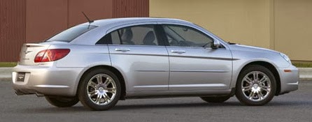
The Chrysler Sebring that's the subject of this post is the final sedan version introduced for 2007, the one with the most curious and awkward styling details.  The people who styled this Sebring are probably still around and can, if they wish, set the record straight in Comments.  For that reason, I will keep my speculations as to why this Sebring was styled the way it was to a minimum, and focus on the appearance of the car itself.

Here are some views of the 2007 Chrysler Sebring four-door sedan.  It has a long "greenhouse" for the passenger compartment coupled with a small trunk area bustle back.  The result is a car proportioned as an almost-station wagon, giving it a slightly ponderous appearance even though the car is not large by American standards.

Another quirk is the set of linear indentations on the hood; somewhat similar lines are found on the Chrysler Crossfire and the Chrysler Pacifica whose production years overlapped the Sebring.  This clearly seems to be an attempt at a styling theme identity for the brand, but it was not carried on the Chrysler 300, introduced for the 2005 model year.  For what it's worth, I never liked these hood surface lines.  Whereas they might be explained as means of stiffening the hood's sheet metal, they simply add clutter to the design.

The third design flaw so far as I'm concerned is where the rear doors interact with the greenhouse.  The door cut line at the rear is a reverse kink that has been used on many cars for many years, but nowadays is largely associated with the BMW 3-series.  If the Sebring had followed the BMW pattern, the roof sheet metal would have followed the door cut.  Instead, perhaps out of fear of being called a BMW copycat, Chrysler stylists continued the side window upper curve downwards until it touched the fender, placing black inserts to disguise the greenhouse part of the door cuts.  This cannot be justified on functional grounds, and it fails aesthetically because it serves to emphasize the overly-long greenhouse.  Fake and awkward are not good styling attributes.

As for the character lines on the sides, the grille, the headlamp ensembles and such, these seem to have been borrowed from the Chrysler Pacifica mentioned above with reference to the hood; note that the Pacifica's lines are raised strakes rather than indentations.  That's a 2004 Pacifica station wagon/SUV crossover in the photo above.

What Were They Thinking?: Lexus LF-NX Concept SUV

The Lexus LF-NX concept SUV did at the 2013 Frankfurt Auto Show what most concept cars are supposed to do: attract attention.  Unfortunately, that attention wasn't entirely favorable.  Here and here are some reactions.

It's supposed to preview a forthcoming production SUV, which presumably will use the basic structure including features such as door and window shapes, the cowling,  amount of front and rear overhang, etc.  Presumably the outrageous features on the concept car will be detoxed somewhat, if not entirely.

Brace yourself as we take a look.

Gallery

Oh Dear.  Where to begin.  For starters, I've never liked Lexus' back-to-back L grille theme, and this tall version is uglier than usual.  I'm also not entirely happy with the baroque character line folding and shaping that has become so common in recent years.  The LF-NX has too much of it and adds a large dose of angularity to the project.  And then there's an odd, subtle fold on the front door sheet metal that makes little sense.  I don't mind the idea of separate fenders, but wonder what effect the amount of bulging on the front of the rear fenders has on aerodynamic efficiency.  The strangest feature is that triangular patch and folding attached to the lower front of those fenders: What is it for?

The side view offers clues as to the production version.  I'm assuming the greenhouse, door cut lines and general shape of the profile will be retained and much bric-a-brac will disappear.

The rear styling is especially busy and not well integrated.  Note the contrast between the tail light areas and the top.  Also observe the discontinuity between the side sculpting and that of the rear; stylists usually try to tie these parts of a vehicle together visually in some way.

This downward view provides more information on all the busyness.  But note how the upward curve of the rear window is picked up by the top of the backlight.  I expect this to be retained for production.